
Friday, 27 February 2015
Wednesday, 25 February 2015
Contents page developments


I tried different theme colours on the contents page to look at what suits the page the most. firstly I tried to change the logo colour to a brighter red to make it suit my models lip colour. However I thought that this was too striking and would draw all the attention from my content pages content. I also made the band index colour a black box with red text colour to make it stand out against the black this however made the text too bright to read so I wanted to change it.
I then changed theme colours again, I changed the logo to white and the K to a dark red. I also changed the band index box to a white rather than a black because I wanted pale colours so my image and text stand out more. These changes in my theme colours made my logo look bold because of the white however it still looked professional in contrast to the bright red which looked misplaced.
On the band index I decreased the capacity to it would fade more into my background image this made sure that attention was not decreased from my background image. I decided to have a band index to appeal to my target audience which is teenagers/young adults that listen to indie artists and band and go to their gigs and concerts. So if they see their favourite artists clearly in that box that will make them want to read on to find the artists.
Monday, 23 February 2015
CONTENTS PAGE DEVLOPMENTS
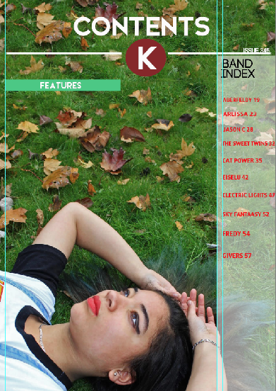
The band index box on the side of the page is inspired from nme magazine. I changed the theme colours on the contents page, I changed to a red logo with the K white because this made the logo stand out on the page in contrast to the vibrant green grass, rather than a green logo that would blend into the grass.
I decided to have the logo in the middle because it looks more professional and unique, I had the idea for this from q magazine which uses a round logo in the middle of the page. Having a logo is more easier than having the magazines name written again on the contents page, feature this is what most magazines use.
Saturday, 14 February 2015
Contents page devlopments


In the image I decided to use on my contents page there wasn't enough room for my text to go over my model at the bottom of the frame. So I decided to use the clone pattern tool to add more of the grass on the top of the image to add more space to write may contents page information.
I took inspiration from Mojo's contents page that uses one image with a lot of space on the top of this image so the features can be on the top of the model. This makes the magazine seem more intriguing because it makes the text the first thing that the reader notices then the image when in other magazine its usually vice verse.
The image that I have decided to use is quirky and different because it represents my magazine and the theme. my model is looking up which makes it look like she's looking at my text that is over her head which makes my readers want to read it.
However the image has leaves on the floor which makes it harder to read the text, so I may have to blur the leaves out using photoshop tools. This will make the grass more green and vibrant.

Subscribe to:
Comments (Atom)