
This contents page uses on image rather that lots of different images, this makes an impact if the main image looks very professional and makes a bold statement this Mojo contents page does that very well. The image is in black and white which makes it seem vintage but this is juxtaposed by the model in the frame which has a modern look and shes giving direct mode of address which makes the image seem more intriguing and mysterious. The text layout is also unconventional because its very close together and there is minimal text this means readers will concentrate more on the image.
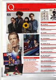
Q magazines contents page has alot of images that lead audiences to the page numbers in the magazine i like this approach because images interest readers it gives them something to look at rather than too much text which can be distracting. I may incorporate this into my contents page and have a lot of images and minimal text because my target audience would appropriate this more.
No comments:
Post a Comment