Friday 1 May 2015

Looking back at your preliminary task (the continuity editing task), what do you feel you have learnt in the progression from it to full product?

front cover

front cover pre


front cover pre


front cover pre
  • On my front cover of my preliminary task my mast head tittle was achieve and i used the A as a logo for my magazine then i used a green box behind, this was effective because the logo made my magazine more distinct and established. However in my finished music magazine i used a more creative name i choose to make my tittle Japanese to appeal more to my target audience interests, also in my mast head i included a competition puff to attract my target audience. 
  • My front cover for my preliminary task isn't at a good standard compared to my front cover of my music magazine that i have produced now. i used Photoshop to construct them both however after my preliminary task i researched more into my music genre and taking inspirations from existing music magazines to help me construct mine. This allowed me to see the conventions of a music magazine and challenge or convey them. 
  • I used more platforms when i was constructing my new magazine front cover i used apps on my phone to edit my picture to make the colors more bright, vibrant and eye catching however in my preliminary task the image didn't look as professional. Also the front cover image in my music magazine looks more creative and initiative however in my preliminary task the image looks more basic. 


Wednesday 25 March 2015

double page spread developments

I've decided to change my layout ideas and instead of having one image on half of the page I've decided that I wanted one big image and two smaller ones on the other side. this layout seems more unique than having only one image on one side which would seem typical as most magazines that I have seen have this layout. I put the text at the bottom of the page which makes the images more bold and attractive and the first thing that my reader sees this is my focal point because my target audience likes to look at images first then the text.   
 
my article starts as a review of a live show then goes into a Q&A then back to a story, I decide to do it like that because I wanted to meet the needs of all my consumers and some may want a review or story and others may prefer a Q&A better because they feel closer to their favourite artist.

 I decided to have a top hits box about my artists because I thought just a chunk of text may put my target audience off so I wanted to have other features to keep them entertained  and I wanted my page to be eye-catching and full with different types of features.


ARTICLE


KOKO HOTEL, LONDON
FRIDAY 13 MARCH 2015

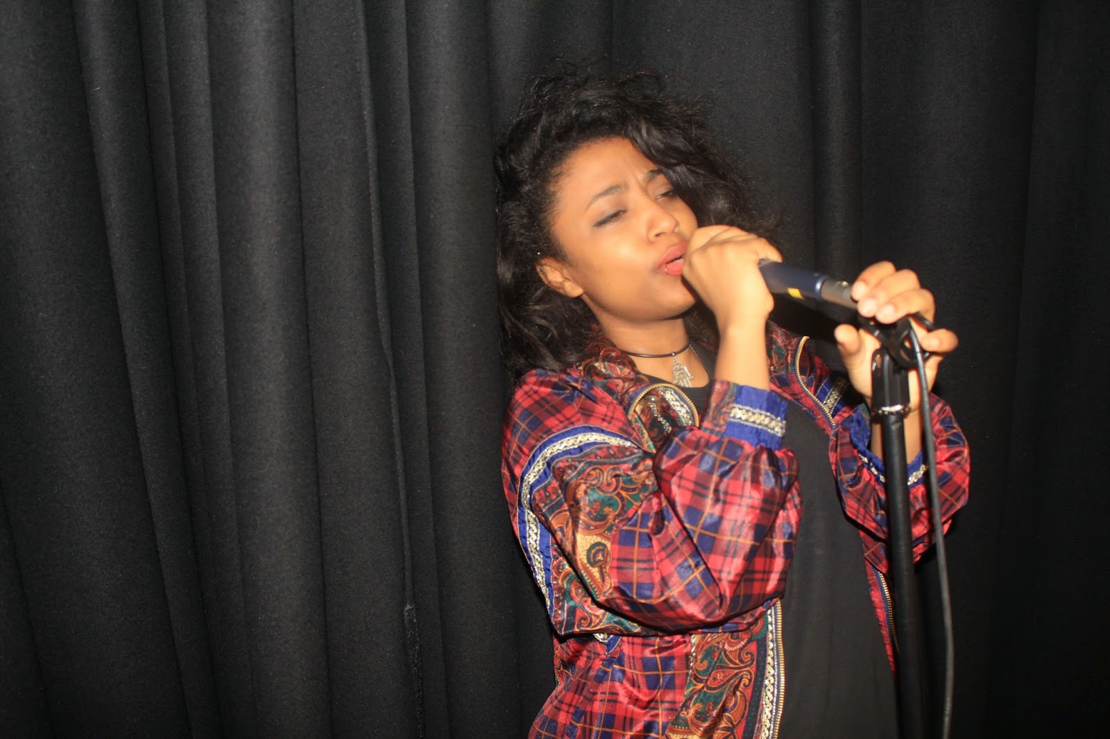
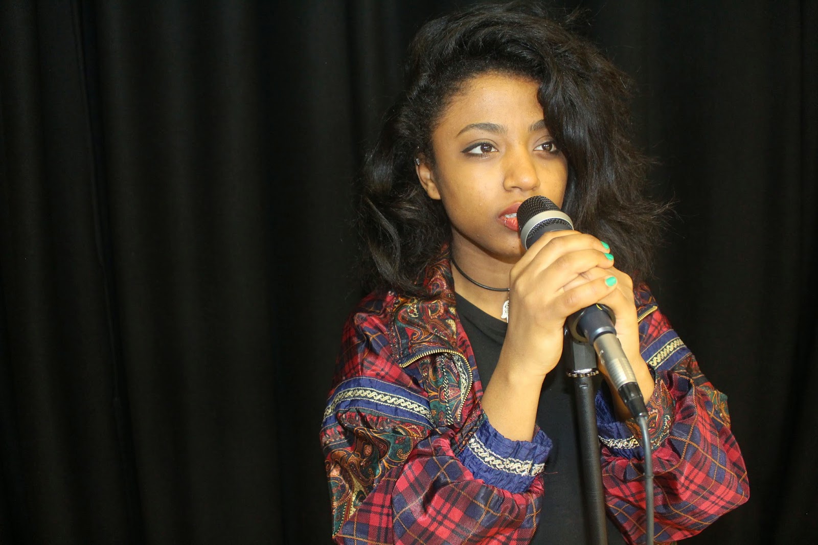
Eliza age 27 last tour continued  at a performance at the Koko hotel in London which had the crowd screaming and going wild. She came to 
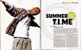
the event in a bold outfit to make a bold statement which reflects her personality and the music she makes.  She sang many songs from her new and last album “free spirit” which included; magic night and glorious return. She began the appearance with a very grateful speech to her fans which supported her in her rising fame she then thanked her new record company for signing her. She started by singing the very well known “dark day” which made it to number 2 in the UK top 40 on iTunes, which had the crowd going wild. She then brought out her first supporting guest which was Amy Georgia which is new on the scene she sang “colours”. The even though her supporting acts were fresh new artists their uniqueness and quirkiness made the crowd mesmerized. Eliza sang all her classic songs that all her fans know and love she sang them with Amy and  The XX. After the performance there was a after party that big names were at having a good time and we caught up with her for a little Q&A:

HOW DID YOU’RE MUSIC CAREER START?
Eliza’s singing careers started at the age of 7 where she joined the school the school choir, which then lead her to do theatre work at the age of 15. During her theatre work she did various up coming shows such as lights, genesis and tricky. Although these wasn't well known Broadway shows this made her more established as a performer. Eliza went to Brits school at the age of 16 which helped her to push start her career even more she learnt new skills to help her voice because she got specialized voice training from music teachers.
"The most eye opening experience was Brits school."
"Brits school showed me the competitiveness of the music business there were many people who were great singers and performs although this motivated me to try harder to become a great singer it. However it also made me doubt myself at times and ask myself "Am I really good enough?”.   

WHERE DO YOU GET INPIRATIONS FOR YOUR STYLE ?
I got the inspiration from many old artists I loved artists such as Rita Fracklin which had very unique and distinctive style I liked the bright colors of her outfit choices and the patterns. I definitely like the 60s to 80s fashion and this is shown through what I wear as I like to shop in vintage stores and I like retro styles. I shop at shops like Blitz they have old era clothes and I love the flared jeans the most. Growing up I always dressed differently to my school friends and my age group but I didn’t care about what people thought about my style choice and that’s the best advise I can give my fans is just be yourself and let that show.

WHAT MUSIC DID YOU LISTEN TO GROWING UP?
I listened to soul music because of my parents which loved artists such as Joe Simon and Blue magic so that’s the music that I grew up around. However I liked to listen to jazz music in m teen years such as Chet baker and Carl Sonny Leyland I just love the sound of the music and the interments used, I guess that’s why I use similar interment choice for my music such as a saxophone. However now I like the new coming artists such as Amy which just performed with me and I also like Bjork their music choice is very distinctive and nothing that I have heard before and I think that their future looks bright.

WHAT DO YOU LIKE DOING IN YOUR SPARE TIME?
I like doing lots of things when I’m not at the studio recording I’m spending time with my friends and family. I don’t get a lot of time off but when I do I try and make the most of it I like to set a goal for myself to do something spontaneous every month, last month I went sky diving last month it was the most scariest moment of my life but it was worth it. I think that we should all do what we want to do while we can we only live one! But other than that I like to spend time with my dog and we watch movies together on the sofa with popcorn, that’s my most favourite thing to do its very relaxing.

WHAT ARE YOUR FUTURE PLANS AFTER MUSIC?
My plans after music is to open my own shop hopefully a vintage shop with clothes from old eras and I would renew them so they seem more modern and will appeal to a younger target audience, I may even have my own clothing line in the future.  I also want to travel the world hopefully my favourite country to go to would be Dubai, its absolutely beautiful and its filled with amazing views. I’m not completely done with music I will hopefully back when I’m ready, but I just wanted a break for a while to explore new career aspects particularly acting. I’ve already been offered a part in a new upcoming horror film my fans will have to stay tuned to see that.


Eliza then enjoyed the rest of the after party in style with many other indie artists performing and there was a special tribute Eliza’s brother to Biff Bang Pow lead singer Joe which was his birthday everyone sang happy birthday. We hope to see Eliza back in the future with a tour or a new album but until then we have all her classic hits to listen to. Eliza’s fans made her a tribute on twitter singing all her songs and this was shown in the After party which had Eliza in tears.  

Wednesday 18 March 2015

Layout draft


This is how the layout for my double page spread is going to look like, the grey boxes is where the images are going to go. I've decided to have one bigger image and two smaller ones on the other side because i wanted the images to be the focal point then the text because thats what my target audience interested in seeing first.
My text will go underneath the text and i will have large headlines over the images to make it more conventional to my genre which tend to have a lot of large text around the page. 
Also i don't want the article to be a big chunk of text so I'm going to break it down into smaller paragraphs to make it less disengaging. The text is quite small and may seem a lot for my target audience so the bigger statements and quotes from the artists are going to be in bright colours so its eye-catching.  

Double page spread inspirations


double page spread sketches

This layout has more images this is more suited to my target audience which would want more visual things to look at rather than reading a lot of text on the other side of the main image. 
Also this layout makes the text more broken down because there are images in between to make it more easier to read and the images will link to the text in every paragraph. 
However this layout may look too busy and make my target audience distracted.  


This layout is more text based and there is one main image on half of the page and the text on the other side of page. This layout looks more professional and sophisticated. However it may come across dull because of the lack of images to look at so the main image has to make a bold statement. 


Friday 13 March 2015

FINAL CONTENTS PAGE


This is my final contents page, I think this appeals to my target audience the colors that I decided to use are bright and vibrant this represents my target user portraying a youthful magazine. The layout is inspired by many indie rock magazines I wanted to have a conventional layout of my genre.


Wednesday 25 February 2015

Contents page developments

I tried different theme colours on the contents page to look at what suits the page the most. firstly I tried to change the logo colour to a brighter red to make it suit my models lip colour. However I thought that this was too striking and would draw all the attention from my content pages content. I also made the band index colour a black box with red text colour to make it stand out against the black this however made the text too bright to read so I wanted to change it.
 
I then changed theme colours again, I changed the logo to white and the K to a dark red. I also changed the band index box to a white rather than a black because I wanted pale colours so my image and text stand out more. These changes in my theme colours made my logo look bold because of the white however it still looked professional in contrast to the bright red which looked misplaced.
 
On the band index I decreased the capacity to it would fade more into my background image this made sure that attention was not decreased from my background image. I decided to have a band index to appeal to my target audience which is teenagers/young adults that listen to indie artists and band and go to their gigs and concerts. So if they see their favourite artists clearly in that box that will make them want to read on to find the artists.


Monday 23 February 2015

CONTENTS PAGE DEVLOPMENTS


The band index box on the side of the page is inspired from nme magazine. I changed the theme colours on the contents page, I changed to a red logo with the K white because this made the logo stand out on the page in contrast to the vibrant green grass, rather than a green logo that would blend into the grass.
 
 I decided to have the logo in the middle because it looks more professional and unique, I had the idea for this from q magazine which uses a round logo in the middle of the page. Having a logo is more easier than having the magazines name written again on the contents page,  feature this is what most magazines use.


Saturday 14 February 2015

Contents page devlopments


In the image I decided to use on my contents page there wasn't enough room for my text to go over my model at the bottom of the frame. So I decided to use the clone pattern tool to add more of the grass on the top of the image to add more space to write may contents page information.

I took inspiration from  Mojo's contents page that uses one image with a lot of space on the top of this image so the features can be on the top of the model. This makes the magazine seem more intriguing because it makes the text the first thing that the reader notices then the image when in other magazine its usually vice verse.  

The image that I have decided to use is quirky and different because it represents my magazine and the theme. my model is looking up which makes it look like she's looking at my text that is over her head which makes my readers want to read it.
 
However the image has leaves on the floor which makes it harder to read the text, so I may have to blur the leaves out using photoshop tools. This will make the grass more green and vibrant.